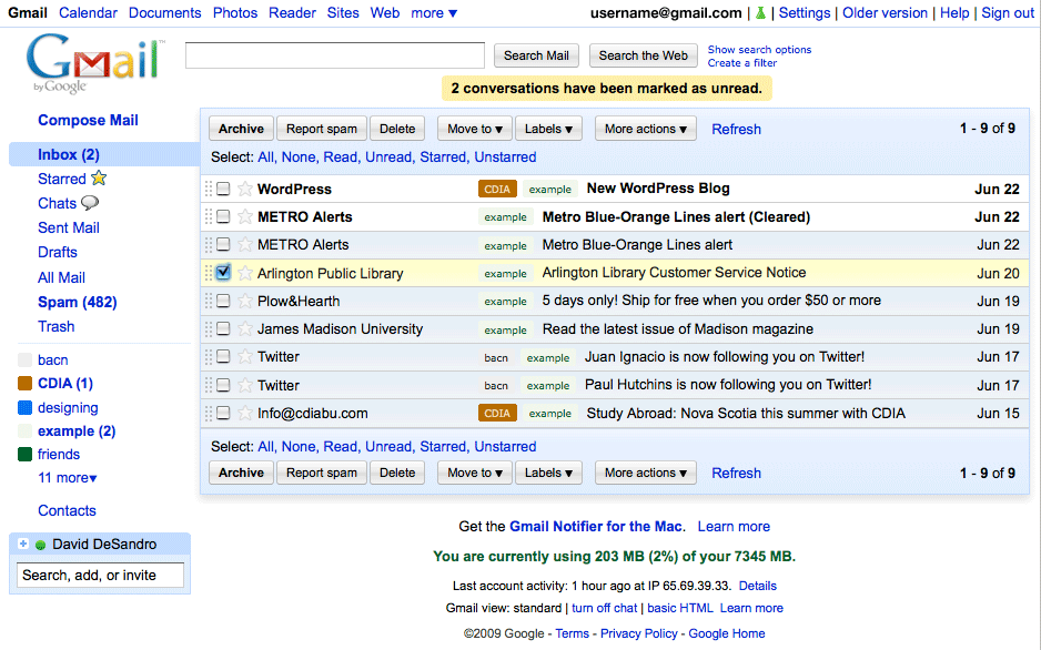
Introducing Gmail Vitamin: a userstyle
Jon Hicks aptly identifies Gmail as the Holy Grail of userstyles. And rightly so—it is incredibly popular, yet it has enough visual quirks to ensure that absolutely no one is happy with its appearance. As such, there are hundreds of Gmail userstyles available. For a while, I held off on attacking the project. But after months of clicking those buttons encased in that awkward thick border, I had enough. Something had to be done.

As you can see, I didn’t want to completely overhaul the interface. Google apps are generally innocuous, an aesthetic I appreciate as the design facilitates the functionality fairly well. All the tweaks I put in place are concerned with resolving some specific quirks that I just couldn’t stand anymore. The buttons are now softened and the 4px border around the main content has been reduced to 1px. I also took consideration to add more padding around most items, as advocated by Khoi Vinh. For a full feature set, you can read all of them on the userstyle page.
While I tweaked the design with either the Classic Gmail theme in mind, the userstyle is compatible with all other themes. In the likely case that you’re not 100% happy with my fixes, I added enough comments so that any user can go in and remove certain styles line-by-line. I, for one, like having no underline for my links until I roll-over them. But I could imagine that others might need those links always underlined, especially when using the other themes.
As with previous CSS themes, all the gradients were generated with the Quickie Canvas. Here’s the script for the glossy buttons:
var grad = ctx.createLinearGradient(0,0,0,h);
grad.addColorStop(0, '#FFF');
grad.addColorStop(.5, '#E8E8E8');
grad.addColorStop(.5, '#DADADA');
grad.addColorStop(1, '#F5F5F5');
ctx.fillStyle = grad;
ctx.fillRect( 0, 0, w, h);
Now about those buttons…
If you’ve never looked under the hood of Gmail, I recommend giving it a try. Open up Firebug and see if you can properly overwrite the background color of any element. The markup is incredibly deep and intricate. It’s mind-boggling at first, un-collapsing an nH div only discover that there are no less than four more nH divs contained within it. And the epitome of this byzantine markup is the Gmail button.
In February, then-Google-lead-designer Douglas Bowman unveiled the new multi-function buttons for Gmail. I do have to tip my hat: it was a tremendous achievement that Bowmen was able to create a pseudo-rounded-corner box with pseudo-shading and make it all work even in IE6. But in order do so the markup for just one button is the following:
<div id="" class="goog-imageless-button goog-inline-block goog-imageless-button goog-imageless-button-collapse-right goog-imageless-button-primary">
    <div class="goog-inline-block goog-imageless-button-outer-box">
        <div class="goog-inline-block goog-imageless-button-inner-box">
            <div class="goog-imageless-button-pos">
                <div class="goog-imageless-button-top-shadow"> </div>
                <div class="goog-imageless-button-content">
                    <b>Button text</b>
                </div>
            </div>
        </div>
    </div>
</div>
I bother bringing this up because I can think of no better example for the case of progressive enhancement. Hacking seven elements to get a faux version of rounded corners and gradient shading seems to be like throwing the baby out with the bath-water, especially considering that the same effect could be better achieved solely in CSS. If Google embraced progressive enhancement, they wouldn’t have to go to such lengths, producing a monstrosity of markup all for a single button. IE6 users would be still get buttons, theirs just wouldn’t be as pretty.
The Gmail buttons are a bit of a Rube Goldberg contraption. But with options like userstyles and Greasemonkey scripts available, I guess I can’t complain. All I’m asking is they make it a little easier next time.