Textpattern Interface Case Study
Ever since John Hicks released his custom theme over a year ago, I’ve taken up the pet project of redesigning the Textpattern admin interface. Now that I’ve released some of these themes, I thought it would be appropriate to discuss my process and what challenges I faced.
Motivation
Why change the Textpattern interface at all? The general consensus from the community was that, while not the most attractive back-end, Textpattern does look okay, and more importantly, it gets the job done. If it ain’t broke, don’t fix it.
While the design of Textpattern wasn’t necessarily broken, I do feel that it fails in one specific area. The look of the interface does not properly represent the brand of Textpattern. Now that I’ve been using TXP for several years, I’ve come to think of as sleek, efficient, modern and easy-to-use. But when I look at the back-end interface, I do not see those characteristics reflected in the design. The tabs look a bit clumsy as the drop shadows are too opaque. The text fields feel dated with that grey background. In short, it feels old, like it would have been the best blogging solution five years ago, not the flexible, modern CMS I’ve come to know it as.
The main goal of my themes was to help close this gap between the design and the brand of Textpattern. The themes wouldn’t just be some shiny new chrome—a redesign just for its own sake. Rather, each detail would have to emphasize the great qualities that make up TXP.
Tab-ula rasa
My primary focus of re-designing the Txp admin interface always began with the tabs. The tabs are the principal navigation element. As I already stated, I wasn’t too big of a fan of the drop shadows. But there’s a bigger issue here: both rows of tabs are too similar to one another. There are only two characteristics that separate the primary row from the secondary row:
- Primary tabs are placed on top
- Primary tabs are colored a slightly darker yellow
 The original admin tabs.
Apart from that, the user has no other visual cues to distinguish between the elements. Shape, size, and behavior are all the same. This is a Gestalt issue. Since the tabs are so similar in appearance, we want group them together. Consequently, differentiating between secondary and primary items is all the more difficult.
I was also reminded of Dave Shea’s article, Get in Shape. In it, he specifically addresses this issue with primary/secondary navigation. When you do not consider the entire composition of both elements, it can result in awkward shapes that do not seem to relate to one another.
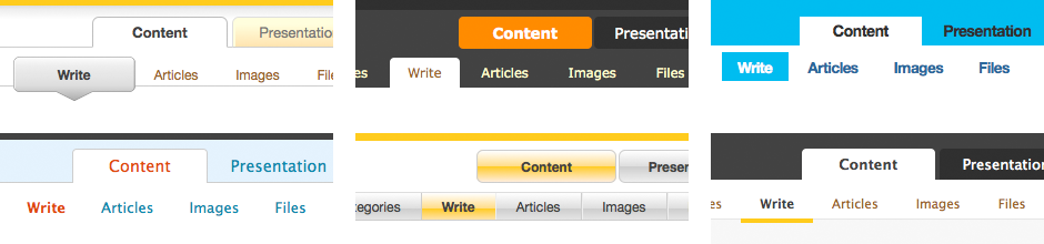 I used different shapes, colors, sizes to distinguish between primary and secondary tabs.
Facing this dilemma, I tried to use different characteristics for the primary and secondary tabs: size, shape, color, and position. To emphasize the child-parent relationship between the two rows, I found the most successful technique was to use tab shapes only on the top row. This is a typical design pattern I saw used with other popular CMS like Wordpress (the 2.5 release) and Expression Engine. Two rows of tabs reminds me too much of a bad Microsoft UI. My favorite solution to the two-row tab problem was the convention of using a heavy bottom border for the secondary tabs, as John Hicks did in his custom theme. This border was subtle enough that didn’t compete with the tabs, but it was strong enough to be noticed. In search for other solutions, Pattern Tap was a true blessing, providing plenty of examples of tabs I could steal from.
Branding
Here’s my best attempt at expressing why Textpattern is great:
Textpattern is small and easy to use, which makes it nimble and fast. Textpattern also has a tremendous capacity for expansion, which makes it flexible enough to handle a variety of purposes.
My aim was to adhere to those two ideals—minimalism and flexibility. In terms of minimalism, this meant keeping “chrome” to a low—making sure that every gradient and drop shadow I put in place had a purpose and was necessary as a design element. For flexibility, I had to consider that Textpattern is used to handle many different kinds of content—blogs, portfolios, brochure-ware, even magazines. The interface that controls those different platforms should be able to fit the role.
The default theme comes with the most prominent design element of Textpattern, that yellow bar (most say yellow, I always thought it was orange). It’s the first thing you see, a bright strip of color right at the top of the page. Part of me loves it, because its so bold and it immediately acts as the brand for Textpattern. But as a designer, I found that working with it was a bit frustrating. #FFCC33 is a serious color, one that’s doesn’t play well with others. I tried several color combinations to see if I could somehow use it to my advantaged, but only ran into frustration. I tried other beiges and pale yellows and oranges, but the results looked too mushy. Adding a black or charcoal gray to the mix made for a bumble-bee / Stryper look. And I didn’t want to try another bold color, like royal blue or blood red, because then they would be competing. In the end, I either kept the yellow un-touched, and used it with a minimal white, or removed it all together.
Buttons
I suppose this a point of contention amongst Interaction Designers, but I prefer buttons to retain their native browser rendering. This maintains consistency within the web application and ensures that the user views a button as a button. Moreover, The smaller buttons (with classes of spsmallbox and the like) don’t look any better than the default browser rendering. Plus, you don’t have to worry about active and hover states in the CSS, as the browser will handle that.
Typography
Looking at the type, Textpattern employs Verdana at 11px. Again, here’s another 2004 design element that doesn’t quite mesh into today’s environment. Verdana was designed for the screen to be legible at small sizes. It’s hey day was 8 years ago, before Clear Type and anti-aliased pixel rendering. Nowadays I see Verdana as dated and clunky. Using other fonts — Helvetica/Arial, Lucida Grande, and even Georgia italic bold — helped freshen up the look.
Execution
Even if the final product of this project isn’t too flashy, I am happy that I took it on for the simple fact that it forced me to stretch my abilities as a web designer.
This was the first time (and hopefully last) that I had to implement CSS for a table-based layout. We now live in a post-standardista world of web design, where table-based layouts have become the fabled gremlins of the dark ages long since past. But here was a great opportunity to bring them back into the light and try working with them. I was immediately reminded why the tables are so loathed. In short, CSS and HTML tables can play well together, but it takes a lot of work. Hopefully, the development team will look to tackle this issue in one of the next releases.
Since I only had CSS to work with, I was forced to adopt data URI images. This is a method I conned off of (who else?) Jon Hicks, who mentioned in his User Stylin’ article for 24ways. But unlike Mr. Hicks, I generated the URI by creating images straight from the canvas element. In fact, creating these themes was the primary reason why I made the Quickie Canvas tool.
Results
View theme demo and download themes
Getting a hang of restyling Textpattern took a while, but once I got it, it was easy to strap on my CSS helmet (it is a helmet, not a hat) and theme it up. So far, I’ve developed 11 themes that are compatible with Textpattern versions 4.0.5 through 4.0.8. I made so many because I kept trying to find that ideal theme that could possibly replace the default CSS. The themes range in many elements I changed and how much I kept the same from the default CSS. Sometimes I touched all the buttons and fonts and headers, sometimes just a couple elements. Smallmarine2 only touches the tabs and the link color, whereas simplexbubble was designed with the goal of a lot of chrome.
Simplexmild is my prime candidate to usurp the default theme. The theme isn’t so much of a re-design as it is a re-alignment. The top tabs are still there, but adding padding and a subtle gradient softens the look. Bottom tabs are replaced by the bottom border a la Hicks. Typography was also given some attention, swapping out Verdana for Helvetica.
Personally, the theme I like the best is the wilsonorange. Still searching for that ultimate minimal theme, I came across Wilson Miner’s site, which he redesigned in October. His site served as an example of how to make something look simple and attractive. The theme is the most basic one I created – no rounded corners or drop shadows. And I kept that big block of orange at the top. For typography, Helvetica is at work, in its trendy tightly-kerned fashion.
The other themes attempt to divert from the original goal of creating a new default theme for the interface. Dropmag was created for dropshado.ws. Wp25 is a port of Jason Santa Maria’s Wordpress 2.5 interface. Smallmarine2 was designed for that corporate blue look. It’s all done with CSS, so everyone is encouraged to fix and tweak to their heart’s content to find their own ideal theme.
Further discussion
Unfortunately, the themes I developed are just CSS files and therefore, I wasn’t able to touch any of the mark up or content. Digging into CSS and HTML, it’s plain to see how piecemeal Textpattern is. Across the various modules within Txp (Write, Forms, Sections, Plugins), the visual consistency is lacking. For example, the Forms and Write modules use h3.plain tags. Some of sub-tabs under Admin use h1.
Part of me wants to see a serious overhaul—scrap everything and build it back up better. Of course, I realize that starting from a blank slate is unrealistic, especially for a platform that has such a large userbase (although there are projects do just that, see crockery and Xpattern ). Plus, the developers have to ensure a good measure of backwards compatibility for the plugins that make Textpattern so flexible.
In the two and half years I’ve been using Textpattern, the interface has undergone only minor tweaks and changes. Compare that with Wordpress, which has seen 2 major redesigns in the same span of time. Granted, these two platforms have a world of difference in between them. Wordpress has a development team, and was able to hire Happy Cog, the web design firm, to do the interface refresh. Textpattern relies on the contributions of its userbase, just a handful of enthusiastic volunteers spread across the world to make the changes to the product. With enough community support, redesigning Txp is certainly an attainable achievement.
I created these themes because I am excited about Textpattern, and I hope to share that excitement with others. As a tool, I love using it every day. it’s the principal device I use to communicate on the web. As a community, I love being a part of something bigger than just a couple CSS files.